

University of Minnesota Athletics

A History of Gopher Baseball's Uniforms
3/24/2021 1:29:00 PM | Baseball
This past Saturday, Minnesota debuted throwback, gray pinstripe uniforms in game one of their three-game series against Northwestern. With the unveiling of the look, the new gray pinstripes represented the program's first pinstripe uniform of any kind in nearly 20 years, while being only the second gray pinstripes to ever be utilized by the program. For many Gopher fans, the jerseys observed during Minnesota's March 20 contest vs. Northwestern brought back memories of uniform combinations from generations passed, making this the perfect time to dive back through the program's storied history of jerseys.
With the 2021 campaign now underway, the history and tradition of the Gopher Baseball program, the oldest sport on campus at the University of Minnesota, now spans across 133 seasons and also stands as John Anderson's 40th year at the helm of the team. A crucial component in the legendary makeup of the program is based on Minnesota's classic and recognizable appearance on the diamond. No one will ever mistake the humble, value-driven and academic-first nature of a Gopher Baseball student-athlete.
This comes as an undeniable reflection of Anderson, as the on-field representation of the club echoes back decades and recalls memories of former greats who donned the same hat and jersey designs. The history of Minnesota's uniform combinations symbolize a call back to a different time that will never be forgotten for countless fans and alumni.
People make the program, as Anderson would be the first to say. One of the truly special individuals behind the scenes of the team's success for more than 30 years was Ted Steichen, who ran Steichen Sports in Roseville, Minn. for 58 years. Steichen can be credited with much more than just providing uniforms to the program. He helped create a cultural look for the Maroon & Gold that lasted nearly four decades and continues to define the face of the Gophers on game days today.
"I started with the Gophers going all the way back to Dick Siebert's final year and George Thomas' first as the head coach," Steichen said. "I'm very fortunate to have the relationships I've had with Gopher Baseball and the people affiliated with the program."
Building relationships were at the forefront of Steichen's work, as it allowed him to gain inspiration for the look of Minnesota's uniforms while allowing him to lean on others when it came to aspects such as lettering and design.
"I take a lot of pride in my work. I'm very proud of my time working with John Anderson and the relationship he and I still have to this day," Steichen said. "I had exceptional people who did the lettering [across the front of the jerseys]. Special people who made that happen. I was very proud of the work we did."
In particular, Siebert always favored a pinstripe uniform. During his tenure, the Gophers utilized a white home pinstripe jersey to go along with gray pinstripes for away games. On the other hand, Anderson has preferred a solid white and gray look. Even so, that did not keep the team from getting creative and debuting their throwback gray pinstripe uniforms on March 20 of the 2021 season.
It is that type of creativity, meshed hand-in-hand with the classic, humble Minnesota look, that Steichen is most proud of in regard to the program's uniform legacy.
"I was most proud of the blue-gray uniform [worn in the late 1980s and early 90s] that had the cardinal-maroon trim," Steichen said. "It was a pro-cut long length uniform that was my favorite."
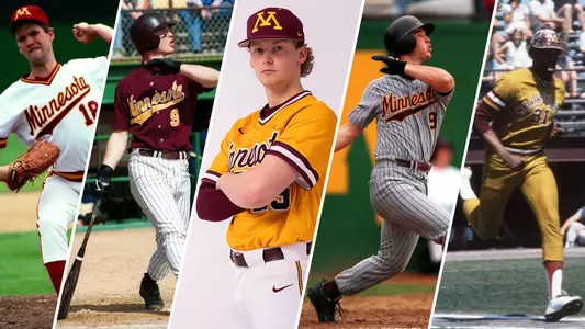
With the throwback gray pinstripes igniting so many memories of past and present Gopher uniforms, it seems only fitting to take a moment to discuss all the different components that have played a part in the team's appearance over the years.
Whites – The Gophers home white jerseys honor the late 1980s and early 1990s Gopher teams, specifically the 1988 and 1992 Big Ten Championship clubs. The uniforms are also a homage to Steichen. The Gophers first introduced the "new" home whites in 2017 when opening the season at U.S. Bank Stadium.


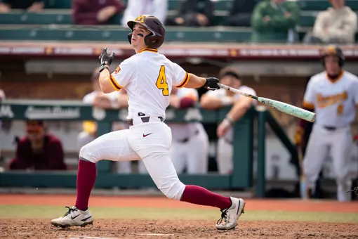
Golds – First introduced in 2019, the gold jerseys are both a new design and a call back to the late 1970s and early 1980s Minnesota clubs. The current Gopher golds are the only gold jersey to pair the color with the Minnesota script lettering with the tail. Previous versions of the gold top included arched "Minnesota" lettering and the slanted "Minnesota" script with no tail (previously worn by the early 80s clubs). Nike, the current supplier of Gopher Athletics gear, does not currently make gold-colored baseball pants. That means the Gophers cannot bring back the full banana suits of old -- yet.


Old Grays – First introduced in 2016, the old grays are Minnesota's oldest current uniform, but also the most classic. The arched "Minnesota" lettering dates back nearly one century to the Frank McCormick days of Gopher Baseball in the 1930s. Coach Anderson has always preferred a road gray to his uniform rotation and the classic grays are as close to any "throwback uniform" that Gopher Baseball has. The current old grays are notable for the 1940s Goldy Gopher (the first official mascot illustration) located on the left arm sleeve.


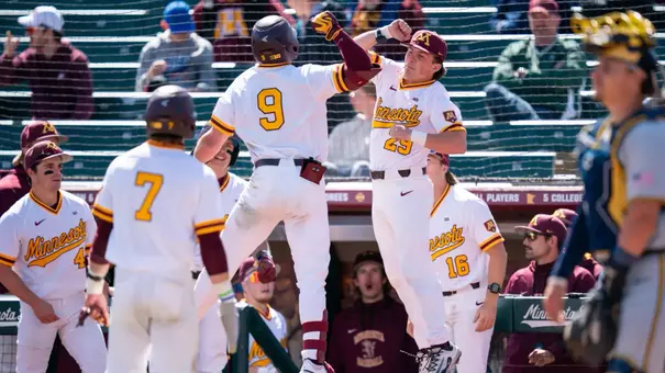
Maroons – The current Minnesota maroons were first introduced during the 2019 season. This is the only uniform top that can be used both on the road and at home. Equipped with the classic "Minnesota" script lettering and tail, the maroon button-up is a tribute to the mid-to-late 1990s clubs that captured the Big 10 Tournament crown in 1998 and the Regular Season Championship in 2000. The left arm sleeve is also unique as it honors the state of Minnesota while the Minnesota "M" pays homage to the location of the team's home Minneapolis campus.


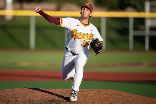
New Gray Pinstripes – Freshly unveiled for the 2021 season, the gray pinstripes are a special blend of a throwback to the Siebert era, the late 1990s gray uniforms and a surprising first for Coach Anderson. The new gray pinstripes are the team's first pinstripe uniform in almost 20 years and only the second gray pinstripe to ever be utilized by the program. A nod to the 1960 Siebert-led teams (which always featured a home white pinstripe uniform with arched Minnesota lettering), the new grays will also be the first uniform in Anderson's tenure to not have a uniform number on the front of the jersey, representing a style that has not been seen on a Gopher Baseball top since the 1971 season. Additionally, the gray pinstripe will have another distinguishable feature that has not been seen since the 1960s: the Goldy Gopher logo on the left sleeve (Gopher Baseball's Goldy used from 1968 throughout the 1970s). Position players will be wearing the new pinstripes uniforms with gold arm sleeves this season, marking another first for the program.


Minnesota Lettering - The classic "Minnesota" script lettering with the tail is as recognizable to Gopher Baseball as any component throughout college baseball. It has been a part of the program's image for nearly three decades of Anderson's tenure. The arched "Minnesota" lettering across the front of the jersey is another staple of Gopher history. Dating back nearly 91 years, all Gopher Baseball uniforms employed the arched lettering across the uniform. Siebert kept with this tradition through the 1970s and the style was brought back in the early 2000s on the cutoff whites and maroon tops.

Minnesota "M" Hat - Gopher Baseball is the only sport at Minnesota to use the classic old school Minnesota "M" on their game hats. The narrow Minnesota "M" dates back to 1948 when Siebert took over the program. Prior to that, Minnesota baseball hats were blank. During the mid 2010s, the Minnesota "M" grew in width on Gopher Baseball's game hats before being given approval to return to the old school "M" in 2017. As a design that honors the legacy that Siebert started 73 years ago, the narrow Minnesota "M" is now exclusive to Gopher Baseball.


"I'm a firm believer in the best uniforms don't need changing," said Anderson. "What we wear and how we wear it is important to me and the kids in our program, because it represents where we came from and how we got here. We are always standing on the shoulders of others and there has been many prominent alumni that have worn these uniforms over the decades. Our Minnesota lettering, classic designs and original "M" is unique and exclusive to the Gopher Baseball program. We're proud to wear a uniform that has lasted a century and is still not only relevant, but one of the absolute best and most disguisable uniforms in all of college baseball."
With the 2021 campaign now underway, the history and tradition of the Gopher Baseball program, the oldest sport on campus at the University of Minnesota, now spans across 133 seasons and also stands as John Anderson's 40th year at the helm of the team. A crucial component in the legendary makeup of the program is based on Minnesota's classic and recognizable appearance on the diamond. No one will ever mistake the humble, value-driven and academic-first nature of a Gopher Baseball student-athlete.
This comes as an undeniable reflection of Anderson, as the on-field representation of the club echoes back decades and recalls memories of former greats who donned the same hat and jersey designs. The history of Minnesota's uniform combinations symbolize a call back to a different time that will never be forgotten for countless fans and alumni.
People make the program, as Anderson would be the first to say. One of the truly special individuals behind the scenes of the team's success for more than 30 years was Ted Steichen, who ran Steichen Sports in Roseville, Minn. for 58 years. Steichen can be credited with much more than just providing uniforms to the program. He helped create a cultural look for the Maroon & Gold that lasted nearly four decades and continues to define the face of the Gophers on game days today.
"I started with the Gophers going all the way back to Dick Siebert's final year and George Thomas' first as the head coach," Steichen said. "I'm very fortunate to have the relationships I've had with Gopher Baseball and the people affiliated with the program."
Building relationships were at the forefront of Steichen's work, as it allowed him to gain inspiration for the look of Minnesota's uniforms while allowing him to lean on others when it came to aspects such as lettering and design.
"I take a lot of pride in my work. I'm very proud of my time working with John Anderson and the relationship he and I still have to this day," Steichen said. "I had exceptional people who did the lettering [across the front of the jerseys]. Special people who made that happen. I was very proud of the work we did."
In particular, Siebert always favored a pinstripe uniform. During his tenure, the Gophers utilized a white home pinstripe jersey to go along with gray pinstripes for away games. On the other hand, Anderson has preferred a solid white and gray look. Even so, that did not keep the team from getting creative and debuting their throwback gray pinstripe uniforms on March 20 of the 2021 season.
It is that type of creativity, meshed hand-in-hand with the classic, humble Minnesota look, that Steichen is most proud of in regard to the program's uniform legacy.
"I was most proud of the blue-gray uniform [worn in the late 1980s and early 90s] that had the cardinal-maroon trim," Steichen said. "It was a pro-cut long length uniform that was my favorite."
With the throwback gray pinstripes igniting so many memories of past and present Gopher uniforms, it seems only fitting to take a moment to discuss all the different components that have played a part in the team's appearance over the years.
Whites – The Gophers home white jerseys honor the late 1980s and early 1990s Gopher teams, specifically the 1988 and 1992 Big Ten Championship clubs. The uniforms are also a homage to Steichen. The Gophers first introduced the "new" home whites in 2017 when opening the season at U.S. Bank Stadium.
Golds – First introduced in 2019, the gold jerseys are both a new design and a call back to the late 1970s and early 1980s Minnesota clubs. The current Gopher golds are the only gold jersey to pair the color with the Minnesota script lettering with the tail. Previous versions of the gold top included arched "Minnesota" lettering and the slanted "Minnesota" script with no tail (previously worn by the early 80s clubs). Nike, the current supplier of Gopher Athletics gear, does not currently make gold-colored baseball pants. That means the Gophers cannot bring back the full banana suits of old -- yet.
Old Grays – First introduced in 2016, the old grays are Minnesota's oldest current uniform, but also the most classic. The arched "Minnesota" lettering dates back nearly one century to the Frank McCormick days of Gopher Baseball in the 1930s. Coach Anderson has always preferred a road gray to his uniform rotation and the classic grays are as close to any "throwback uniform" that Gopher Baseball has. The current old grays are notable for the 1940s Goldy Gopher (the first official mascot illustration) located on the left arm sleeve.
Maroons – The current Minnesota maroons were first introduced during the 2019 season. This is the only uniform top that can be used both on the road and at home. Equipped with the classic "Minnesota" script lettering and tail, the maroon button-up is a tribute to the mid-to-late 1990s clubs that captured the Big 10 Tournament crown in 1998 and the Regular Season Championship in 2000. The left arm sleeve is also unique as it honors the state of Minnesota while the Minnesota "M" pays homage to the location of the team's home Minneapolis campus.
New Gray Pinstripes – Freshly unveiled for the 2021 season, the gray pinstripes are a special blend of a throwback to the Siebert era, the late 1990s gray uniforms and a surprising first for Coach Anderson. The new gray pinstripes are the team's first pinstripe uniform in almost 20 years and only the second gray pinstripe to ever be utilized by the program. A nod to the 1960 Siebert-led teams (which always featured a home white pinstripe uniform with arched Minnesota lettering), the new grays will also be the first uniform in Anderson's tenure to not have a uniform number on the front of the jersey, representing a style that has not been seen on a Gopher Baseball top since the 1971 season. Additionally, the gray pinstripe will have another distinguishable feature that has not been seen since the 1960s: the Goldy Gopher logo on the left sleeve (Gopher Baseball's Goldy used from 1968 throughout the 1970s). Position players will be wearing the new pinstripes uniforms with gold arm sleeves this season, marking another first for the program.
Minnesota Lettering - The classic "Minnesota" script lettering with the tail is as recognizable to Gopher Baseball as any component throughout college baseball. It has been a part of the program's image for nearly three decades of Anderson's tenure. The arched "Minnesota" lettering across the front of the jersey is another staple of Gopher history. Dating back nearly 91 years, all Gopher Baseball uniforms employed the arched lettering across the uniform. Siebert kept with this tradition through the 1970s and the style was brought back in the early 2000s on the cutoff whites and maroon tops.
Minnesota "M" Hat - Gopher Baseball is the only sport at Minnesota to use the classic old school Minnesota "M" on their game hats. The narrow Minnesota "M" dates back to 1948 when Siebert took over the program. Prior to that, Minnesota baseball hats were blank. During the mid 2010s, the Minnesota "M" grew in width on Gopher Baseball's game hats before being given approval to return to the old school "M" in 2017. As a design that honors the legacy that Siebert started 73 years ago, the narrow Minnesota "M" is now exclusive to Gopher Baseball.
"I'm a firm believer in the best uniforms don't need changing," said Anderson. "What we wear and how we wear it is important to me and the kids in our program, because it represents where we came from and how we got here. We are always standing on the shoulders of others and there has been many prominent alumni that have worn these uniforms over the decades. Our Minnesota lettering, classic designs and original "M" is unique and exclusive to the Gopher Baseball program. We're proud to wear a uniform that has lasted a century and is still not only relevant, but one of the absolute best and most disguisable uniforms in all of college baseball."
Follow Minnesota Baseball
Support Minnesota Baseball
Support the University of Minnesota Baseball program. Your support helps our student-athletes succeed athletically, academically, and socially. It takes just seconds to make a monthly or one-time donation. Thank you for your support! Give Now
Driven to the Diamond: Weber Neels
Thursday, May 14
Highlights: Gophers 13, Michigan 1
Friday, May 08
Highlights: Gophers 5, Penn State 3
Saturday, May 02
Highlights: Gophers 5, Penn State 4
Saturday, May 02